The transition from the old Hope House logo to the rebranded logo created by Anabliss Design + Strategy in 2003 was guided by a few important principals. First, the rebranded logo was meant to distance itself from the dated feel of the old logo while bringing in a more professional look. Second, the rebranded logo was meant to fix simple design errors like thin text, difficult to match colors and poor contrast. Last, the rebranded logo was meant to be simple and easy to identify, even when it is shrunk down. The logo was reworked again in 2019 to remove the ‘of ’ phrase for ease of use when referencing Hope House and its affiliates. These principals not only guide the logo for Hope House, but also the branding of Hope House itself.
Official Logo
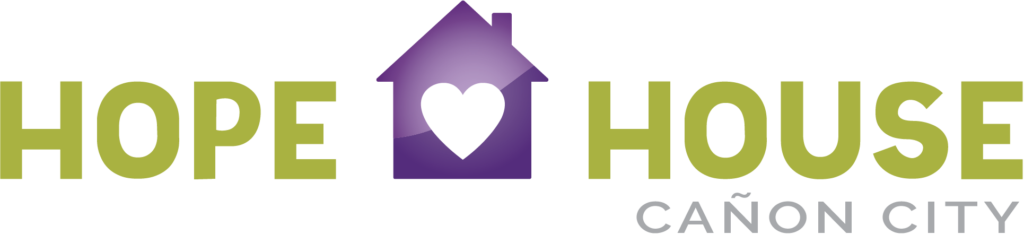
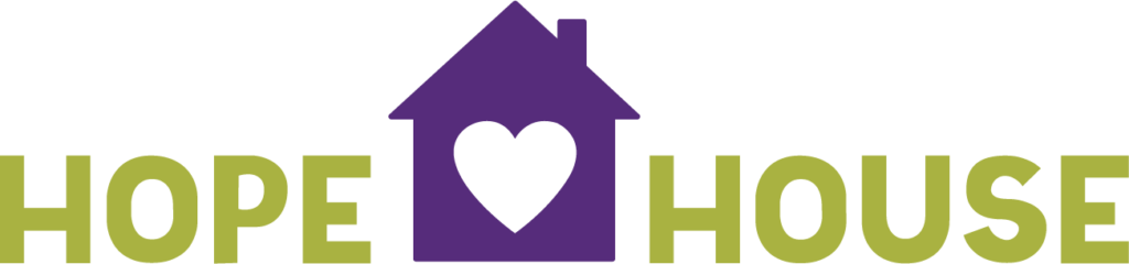
Our official Hope House logouses a custom font to provide a simple but professional design for the main Hope House brandmark. The location name (in this case, Colorado) is created using Raleway font, right justified to the edge of ‘House’ in the main logo.
Affiliate Logos
New affiliate names should use font size and kerning that shall remain consistent to the 2019 updated Hope House logo. The name of the affiliate shall be right aligned with the rest of the logo and shall not extend beyond the left side of the “H” in HOUSE. If the affiliate name is too long, the font should be proportionately shrunk down to align with the left side of the “H” in HOUSE.
Logo Variations
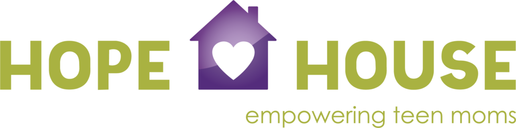
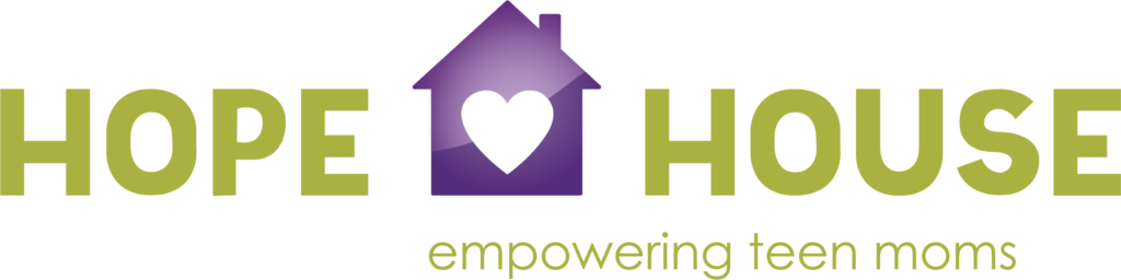
1. Core Lockup Logo With Tagline
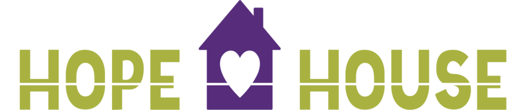
2. Core Lockup Logo Without Shadow or Gradient
3. Core Lockup Logo in Solid Green, White or Black
4. Core Lockup Logo Stacked
5. House Icon
6. Tagline
Logo Usage Grid
This table shows how to choose the right logo for any communication piece. Please note, each affiliate location should use the logo that denotes their particular location, either in the horizontal or stacked shapes as mentioned below. For marketing and communication, different logos apply according to its use. If you have any questions, please contact info@hopehousecolorado.org.
Clearing Space
The Hope House identity must always be surrounded by a minimum of open space known as clearing space. This staging area has been established to ensure the identity is not crowded by other elements and has maximum clarity and high visibility wherever it is used. A minimum staging area distance equal to the height of the logotype letter ‘H’ must be maintained completely around the identity to separate it from other type of graphics.
Logo Placement
You have the freedom to place the logo where it fits best in your design. That said, it should always be fully visible, and the clearing space adhered to for each logo mark variation. The one exception to this rule is our one-pager designs as shown in the example below, which require the use of the horizontal logo with two options for placement.
One-Pagers
General Designs
Don't Even Think About It
DO NOT substitute any other colors for approved colors.
DO NOT substitute any other colors for approved colors.screen/make transparent
any part or all of the identity.
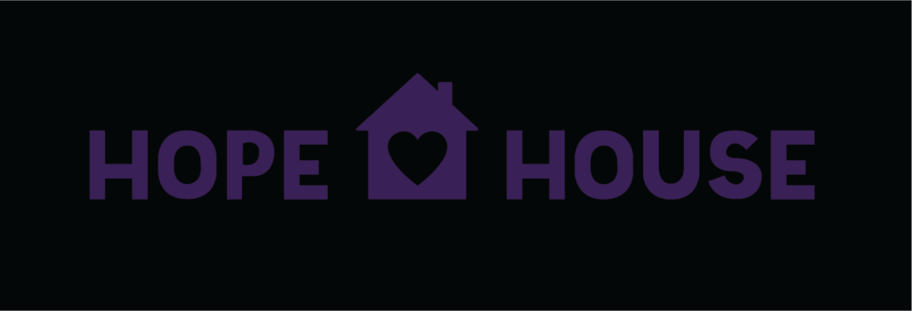
DO NOT reproduce identity in black or in color on a dark background.
DO NOT substitute any other colors for approved colors.
DO NOT change proportions of any part of the identity.
DO NOT DO NOT distort or modify identity in any way.
DO NOT outline any part or all of the identity.
DO NOT add the tagline to the logo manually.
DO NOT use gradient/shadow logo on anything other than a white background.
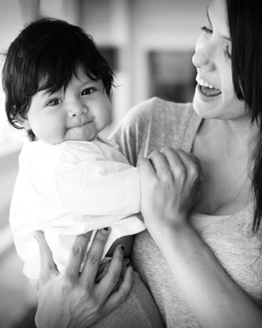
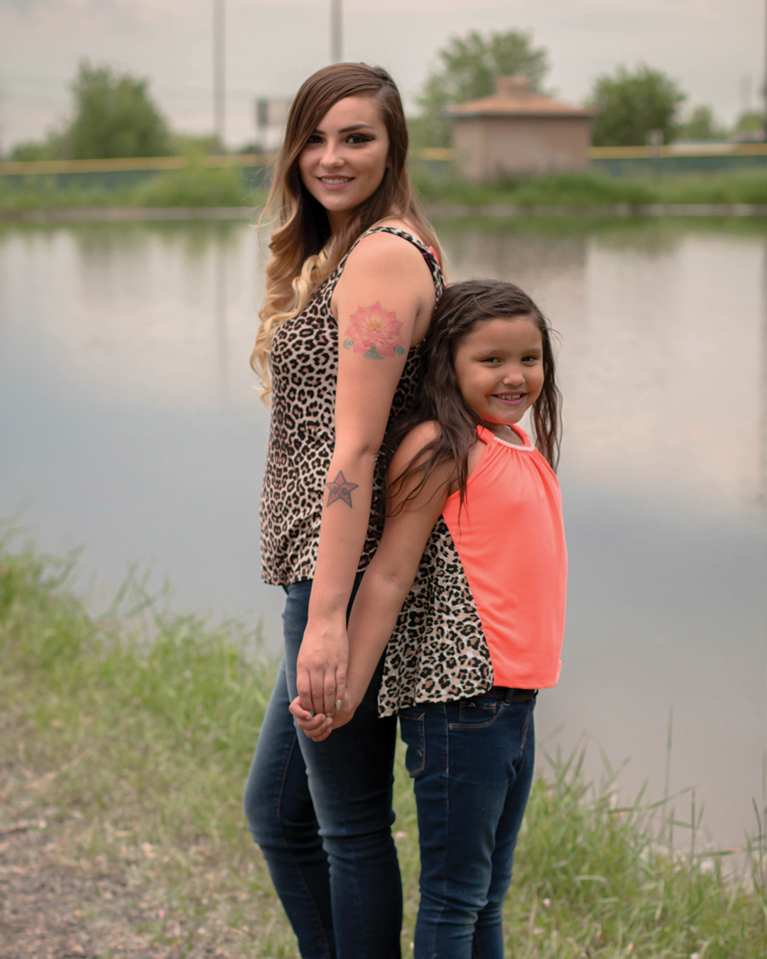
Lauren is a teen mom who was raised by a mother who depends solely on government assistance. With the encouragement of her Hope House Mentor, Lauren decided to break the mold and become independent, but her family was not willing to support her decision. Through the donation of a reliable used car, Hope House was able to make a real difference in Lauren’s journey:
“Recently I was blessed enough to receive a donated car from Hope House. The weight lifted off my shoulders the moment the keys were handed to me. Now I am not only able to attend college and take my daughter to my mom’s during class, I have also been lucky enough to start working. When it comes down to it, I wouldn’t be as successful without my car.”
Today Lauren is living on her own and is working for one of our Career Partner businesses, where she is up for a promotion!
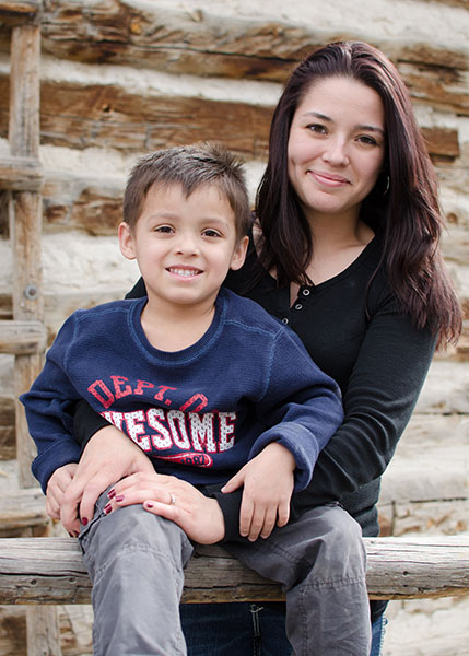
Kori
2013
A teen mom without much hope, Kori joined our GED Program this summer. Her story is hard to hear and includes physical and emotional abuse at the hands of her own family. However, she is committed to breaking this cycle of abuse and providing a different kind of childhood for her three little daughters. With this goal in mind, Kori is now attending our Parenting classes, where she is known to be one of the most enthusiastic, engaged students!
Hope House recently received this note from Kori:
Thank you so much for believing in me when I didn’t believe in myself. Thanks to you I’m getting my GED, I’m bettering my life, and I’m going to be someone in life. Now my kids can look up to me. Thank you Hope House for giving us a better tomorrow.
With love, Kori
Vanessa
2014
Vanessa first used alcohol at the tender age of 8. She dropped out of school in 10th grade and became a mom at age 16. Unfortunately these are common realities for a young woman growing up in poverty. However, not only did Vanessa grow up in generational poverty, she also grew up in an environment that did not trust the police force and actually hated police officers.
Fortunately Vanessa found Hope House where she earned her GED and joined our Mentoring program. Wanting to break out of the vicious cycle of poverty, she explored a variety of career options. Through this process, Vanessa had the opportunity to go on a drive-along with an Arvada police officer. This experience completely changed Vanessa’s perspective of the police force, and she now wants to join the legal system by becoming an attorney! We look forward to offering Vanessa practical support through our Learning Lab as she enrolls in college to pursue her dream!
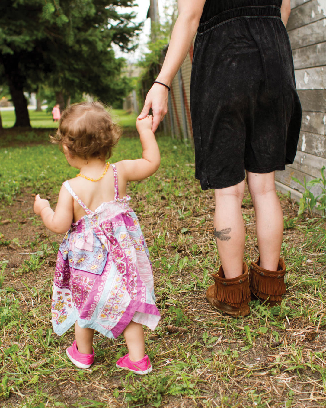
Alondra
2015
Alondra is a teen mom following her dreams. She has a scholarship and is attending Metro State University of Denver where she is working toward an RN degree. She lives downtown with her son and works part-time while attending college full-time.
Alondra’s journey is amazing because she had many challenges to face… she became a mom at age 16. That fact alone meant she had less than a 1% chance of ever earning a college degree!
Alondra also had to overcome homelessness and generational poverty.
Today at age 19 with a 3-year-old son, Alondra is still a teen mom. But she is also a graduate of Hope House Colorado, and she is working hard toward self-sufficiency. Her future is bright!
Brittani
2016
Brittani was born into poverty and chaos — and her mother struggled with cancer and her father with kidney failure. Dropping out of school in 10th grade, Brittani was pregnant by age 15 .
Brittani named her baby girl Deavyne and set out to create a different life for her daughter than she had known growing up. One of her friends told her about Hope House, where she earned her GED so she could go on to college. She also met with her Hope House mentor regularly and took Parenting classes at Hope House.
Today Brittani has finished her degree program and works full time as a Medical Assistant with benefits… and she loves her job!
She has been living in the same duplex for two years, which is longer than she has lived anywhere in her life. Her daughter goes to school a half block away and loves it. Brittani and her boyfriend are working on their credit score so they can buy a house.
“For the first time in my life, I feel stable and stress free. And I couldn’t have gotten here without Hope House to get me started,” says Brittani.
Stephanie
2017
Stephanie is no longer the vulnerable, frightened teen mom who applied to Hope House.
Her background is not uncommon around Hope House. Stephanie grew up in generational poverty, became a mom as a teenager and dropped out of school. By the time her daughter was born, her boyfriend was gone. She was sleeping with her baby girl on a couch in a crowded mobile home.
Fortunately Stephanie found Hope House. She knew she would have to work hard — her first educational assessment placed her at 5th grade.
And so she worked hard! I am proud to say Stephanie earned her high school diploma through one of our online high school partners. She also completed our Parenting, Healthy Relationships, and Financial Literacy classes – as well as an internship at Head Start.
Stephanie’s last requirement was to find full-time employment. With support from our College & Career Program, she found a customer service position at PC’s for People, a non-profit organization that provides computers to low-income individuals (I love seeing the process come full circle in her life!).
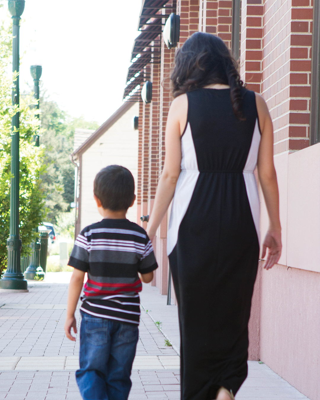
Kathryn
2018
The teen moms at Hope House are true heroes… Kathryn is no exception. We are not the only ones impressed with her incredible resilience in the face of hardship – Kathryn was recently given the Adams County Mayors and Commissioners Youth Award!
In 2018, Kathryn wrote and recorded her story for Hope House. You can view that video hereand learn about her incredible resilience!
Janelle
2019
Janelle remembers when her world crumbled. She was 12 when her parents’ fights and addictions led them to split. Although Janelle and her brothers were already used to living in chaos, now they were left on the sidelines, trying to take care of themselves. Janelle ended up meeting an older boy – and they connected deeply as they shared stories from their rough childhoods.
By age 14, Janelle was pregnant, and that same boyfriend became abusive, leaving her with bruises make-up couldn’t cover. By the time Joseph was born, Janelle had stopped going to school. By the time he turned four, Janelle had another baby boy.
Janelle and her boys eventually became homeless — sleeping in a car, on the ground, or in homeless shelters. Sleeping in a car was actually a good night because the ground was cold and the shelters were crowded, smelly and scary.
Janelle knew she had to make a change.
She found Hope House online and enrolled in our GED Program. Surrounded by staff and volunteers who encouraged her, Janelle began to feel hope.
Six months later, Janelle had earned her GED and had found her own confidence. With the support of our College & Career Program, Janelle applied to the Community College of Denver and began working toward a certification in machining.
The tutors at Hope House helped Janelle when she needed it, and she stuck with the program. When she graduated, she was offered a job at Ball Aerospace as a machinist. Today Janelle is loving her job, where she gets to use the skills she learned in college. She also now owns her very own house, where she and her boys are thriving!
Edith & Ian
2020
Edith, pictured with her son Ian, started at Hope House in February 2019 when Ian was just five months old. At the time, Edith was experiencing depression while facing the economic challenges of being a teen mom. After a friend introduced her to Hope House, Edith felt the encouragement she needed to move forward with her life and build a healthy future for herself and her son. In a year’s time, she was able to cover her expenses and begin saving for a down payment for a house.
During the year of the pandemic, Edith accessed our curbside Grab & Go for food and essentials; took virtual parenting and healthy relationships classes; received individual counseling; and participated in group classes to support mental health on her path to building a healthy future for herself and her son. She works at Amazon and continues to make smart financial decisions to reach her goal of owning a home.
Fatima & Julian
2021
Fatima’s childhood felt very lonely and isolated. Her family dynamics were difficult, and at an early age she felt neglected and left to fend for herself. As a preteen, she was given freedom without the tools to navigate it. Landing in the wrong circle of friends, Fatima began smoking and drinking at age 10. At 15, she found out she was pregnant. Already struggling with little support, five months into her pregnancy, Fatima lost her brother to suicide.
Life felt so intensely depressing that Fatima feared she would have a miscarriage. Her living situation with family was chaotic and unsafe all throughout her pregnancy, but at 16—with little support or encouragement—she gave birth to her son Julian.
Falling into a deep post-partum depression, Fatima knew something needed to change.
Fatima heard about Hope House through a friend of a friend, and after having joined the program, she quickly began working on her high school equivalency through Penn Foster. She also applied to and was accepted into the Residential Program. Fatima and Julian moved into the house and started making friends with other moms and staff. A residential staff member had a huge influence on her and became like a grandmother to her, something Fatima never had. Older moms in the house became mentors and guides to her. At the house, Fatima found a caring community.
Through classes at Hope House, Fatima learned how to set boundaries and establish healthy relationships. Hope House also helped her get a car, a paid internship with Jefferson County and an apartment.
Today, Fatima and Julian live in an apartment by themselves. She feels safe and is excited to provide an environment for Julian that is supportive and caring, two things she longed for as a child. Eventually, Fatima hopes to become a tattoo artist. She is drawing every day to practice her skills while raising her lively, talkative and energetic little boy.
Reflecting on her own experience and what she would say to a future or current teen mom, Fatima genuinely shares, “I’d ask her where she sees herself in the future. I’d ask her who she has as support. And if she says she doesn’t have anyone, I’d tell her I’ll be her absolute best friend. I’d tell her I’ll support her. I’d tell her my story. I would want to be that person, that support system, that I needed three years ago.”
Since becoming a Hope House Mom, Alejandra has been able to finish her GED through Penn Foster in February of 2022 and is incredibly thankful for the support and motivation she had through Hope House Staff. She attended the GED graduation in May 2022 and gave the graduation speech. Janely, Alejandra’s 9-month-old-daughter, is also enrolled in the Early Learning Program. At first, Alejandra said, “I was hesitant because of bad experiences I had with babysitters for Janely, but I got to meet the staff and they’re really nice and I’m never far away from [Janely] which is really great”. Alejandra has also taken other classes including Parenting 101, Relationship Classes, and Self-Care classes.
Alejandra is so proud to have graduated Penn Foster in only two months and have gotten her permit and driver’s license since becoming a Hope House Mom. Alejandra also attended a House of Congress meeting and testified on behalf of the Colorado Teen Parent Collaborative and Bill HB22-1042 to support the state providing driver’s education to teen parents. “I’m very vocal about the rights of my community – the Hispanic community, the Teen Parent community, and the people around me,” Alejandra explained.
Alejandra hopes to get her Real Estate License and move into that field, to find an apartment, and to continue to create a bond with Janely where Janely can tell Alejandra “anything and everything. I want to see her grow up and do something she is passionate about, and to be able to get her started with a good and healthy foundation.”
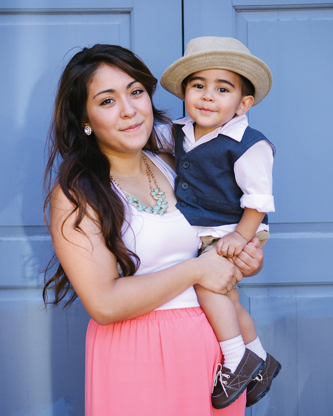
Alejandra & Janely
2022
Alejandra found out that she was pregnant just days before her 17th birthday. An “A” student who had spent her first three years of high school taking IB and college classes, as well as working, Alejandra wasn’t sure what her life would look like as a teen parent. Alejandra hid her pregnancy until she was about six months along, and eventually told her parents and friends. She felt shamed and scared, and she was struggling with preeclampsia and migraines as she got closer to her due date. Eventually, Alejandra got connected to Hope House through clinic staff at the office where she went to get ultrasounds. At first, she was nervous about what her family would say, but in January of 2022, Alejandra became a Hope House Mom and has loved it ever since.
Since becoming a Hope House Mom, Alejandra has been able to finish her GED through Penn Foster in February of 2022 and is incredibly thankful for the support and motivation she had through Hope House Staff. She attended the GED graduation in May 2022 and gave the graduation speech. Janely, Alejandra’s 9-month-old-daughter, is also enrolled in the Early Learning Program. At first, Alejandra said, “I was hesitant because of bad experiences I had with babysitters for Janely, but I got to meet the staff and they’re really nice and I’m never far away from [Janely] which is really great”. Alejandra has also taken other classes including Parenting 101, Relationship Classes, and Self-Care classes.
Alejandra is so proud to have graduated Penn Foster in only two months and have gotten her permit and driver’s license since becoming a Hope House Mom. Alejandra also attended a House of Congress meeting and testified on behalf of the Colorado Teen Parent Collaborative and Bill HB22-1042 to support the state providing driver’s education to teen parents. “I’m very vocal about the rights of my community – the Hispanic community, the Teen Parent community, and the people around me,” Alejandra explained.
Alejandra hopes to get her Real Estate License and move into that field, to find an apartment, and to continue to create a bond with Janely where Janely can tell Alejandra “anything and everything. I want to see her grow up and do something she is passionate about, and to be able to get her started with a good and healthy foundation.”